
Kaiser Permanente
Native Mobile App
About
The mobile app for Kaiser Permanente (KP) is available to members and allows them to engage with their healthcare provider as they would through the web, with additional mobile-specific features.
Role
I participated as a UX designer on the team assigned to the project at Redshift Digital. I supported the lead designer, facilitated ideation and client presentations, and owned aspects of the UX work. Our team included visual designers and engineers, and I collaborated with producers and product managers to deliver the final product.
Business Goals
The KP app will provide an innovative and immersive experience to compel more members to download the app.
Design Goals
Our design mission was to create the ultimate expression of the brand for the native mobile environment.
The Problem
“Help me figure out the health care system and organize it—like a health care advocate.”Users could perform basic tasks in the current app, such as scheduling an appointment or refilling a prescription, but felt little support from their care team between these touchpoints. As part of a large-scale rebranding and UX update, Kaiser Permanente wanted to create a cohesive, consistent member health care experience in the mobile app.
Original Web and Mobile Screens

The current mobile app provided access to basic tasks but did not go above and beyond.
Product Goal
Design a native mobile application that fosters a seamless health care experience through digital and physical realms.
Example: Your doctor has access to health tracking data and already knows your exercise and sleep habits when you arrive at your appointment.
The Consumer Relationship Spectrum
Responsive mobile browsing is for reach: Meet customers where they are.
Native app is for engagement: Put users at the center of their digital experience.

The KP mobile app will:
- Use the phone’s native engagement features such as reminders, notifications, and alerts to bring the user into the app
- Immerse the member in the experience through hardware specific features such as geolocation, gestures, and camera
- Be there when there is an immediate health need such as displaying the ID card or triaging a health concern
- Deliver a more polished, richly interactive experience
The Approach
We focused on six principles, which are derived from KP brand values, user research, and UX best practices.

Where we started
The Assumptions
The mobile app should:
- Streamline and simplify major use cases, such as booking an appointment or refilling a prescription
- Build the relationship between members and their care team
- Onboard people to healthy habits

Research Strategy
How Do You Think About Your Health?
To define the scope of such a large, open-ended problem and identify user pain points across a vast spectrum, we completed three different types of research studies: a benchmark survey, one-on-one interviews, and an industry app review.

Benchmark Survey Results
We asked members to select which features they'd like to access within the app. Set health goals and track progress scored the highest, while shop for and enroll in a health plan scored the lowest.

The Interviews
We talked to 2 KP members and 6 non-members from the Bay Area.
We set out to find out how people think about their health and the tools they use to manage it, and understand their mindsets about app ecosystems, especially around healthcare.
Participants completed two pre-work assignments exploring attitudes toward health conditions and routines, tasks and tools, and in-home interviews, including discussion around pre-work, a tour of their smartphone and specific needs.
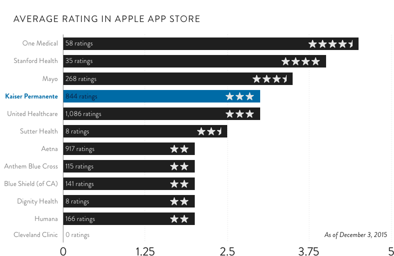
Industry App Review
In addition to ratings on the app store as shown at left, we looked at UX patterns. Tile-based dashboards and hamburger menus are the most common navigation styles and many apps have both. KP wanted the core app to be the hub of an "app gallery," a system of multiple integrated apps. We found app galleries are emergent but not commonplace.
1. The healthcare experience is complex and fragmented.
2. When people leave the doctor’s office, they feel disconnected from their care team.
3. People have to be assertive and fight for their health.
4. Getting the basic experience right trumps cutting-edge features.
At the end of the day, they led back to one overarching sentiment.
I’m in this alone.

"Help me navigate these community services. They aren’t efficient. Everyone is so overwhelmed."
Theme: The healthcare experience is complex and fragmented.

"The medical practice is appointment-oriented. You see them, you get a prescription, and you're gone. There's a need for continuous feedback."
Theme: When people leave the doctor’s office, they feel disconnected from their care team.
"I’m a more vocal advocate for myself now. I’m learning through these experiences that you have to be the squeaky wheel or you don't get the best care."
Theme: People have to be assertive and fight for their health.
!["[The app] should be functional first, and then build in the other stuff."Theme: Getting the basic experience right trumps cutting-edge features.](https://images.squarespace-cdn.com/content/v1/52faba2ce4b0a969cf8e0d88/1505781797751-6IQ64E0NUSHP37LEU6MM/Eugene.jpg)
"[The app] should be functional first, and then build in the other stuff."
Theme: Getting the basic experience right trumps cutting-edge features.
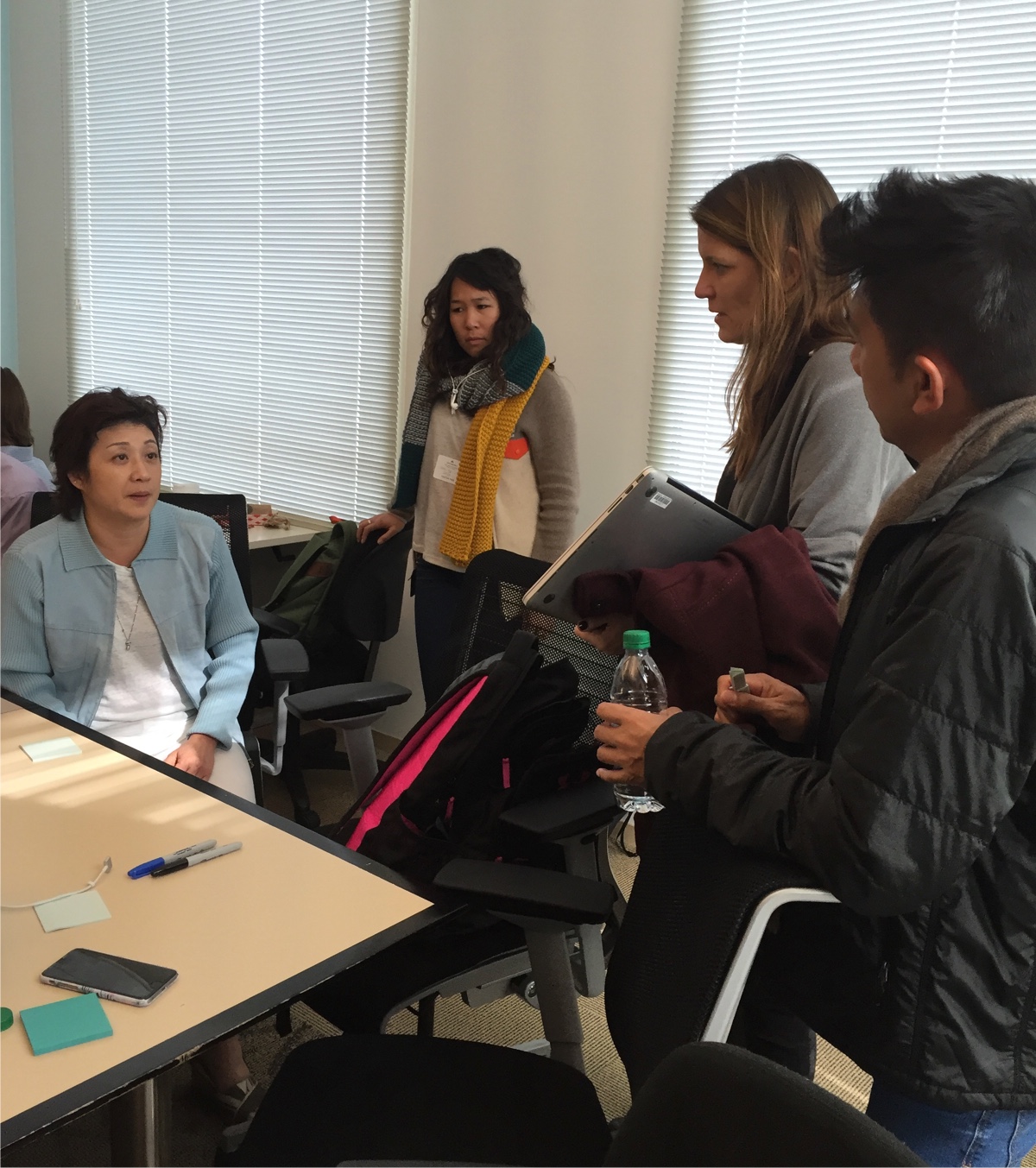
Ideation
Defining The End User
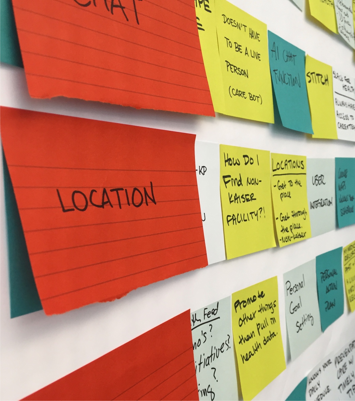
We shared insights from user research with the stakeholder group and asked them to write down ideas they'd like to see included in the app. We grouped similar concepts together (affinity mapping) and discussed the results. While we ended up with a much broader picture than could be accommodated in the first version of the app, it was useful to understand what was most important to the client. We could further refine these goals by visualizing them through wireframes.
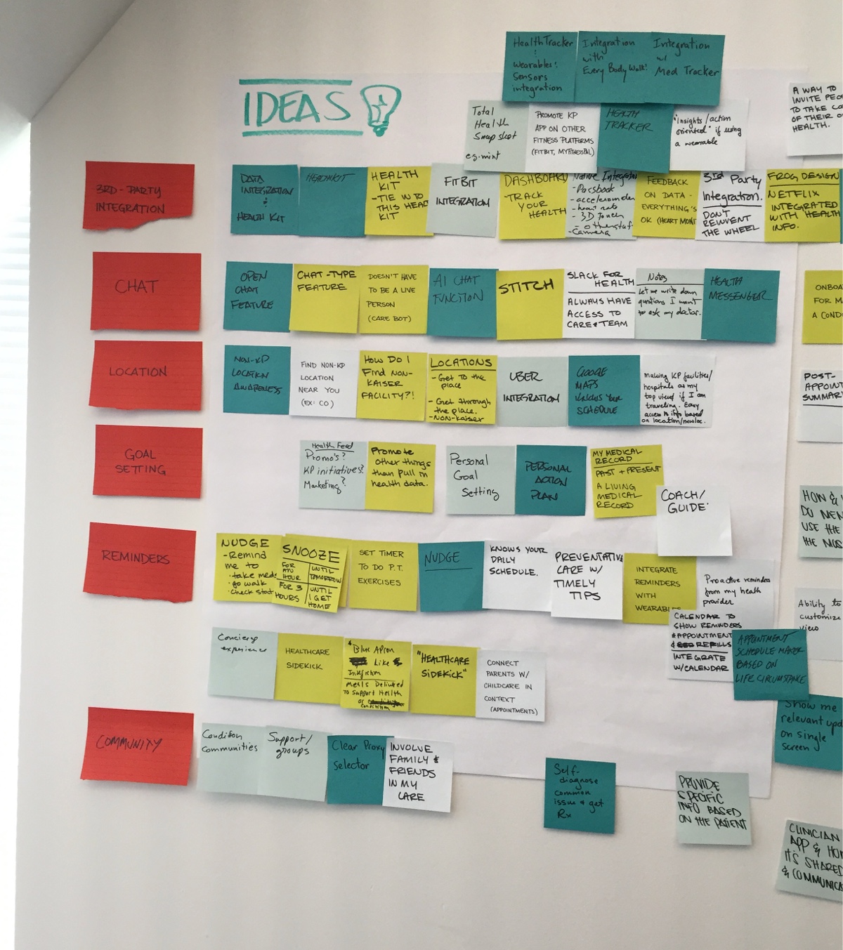
Ideation Insights
The app will:
- be useful for members who are young and healthy and those who are managing complex health conditions,
- use data to engage the user proactively,
- excel at assisting the user to complete common tasks and have a positive, encouraging tone.
We also prioritized engaging features to elevate the native mobile experience:
- Integration with third-party services like FitBit and Uber
- Proactive, personalized reminders
- Showing all relevant updates in one place
- An open conversation with care team through chat
Once we gained definitive direction based on user research and stakeholder input, the design could begin to take shape.
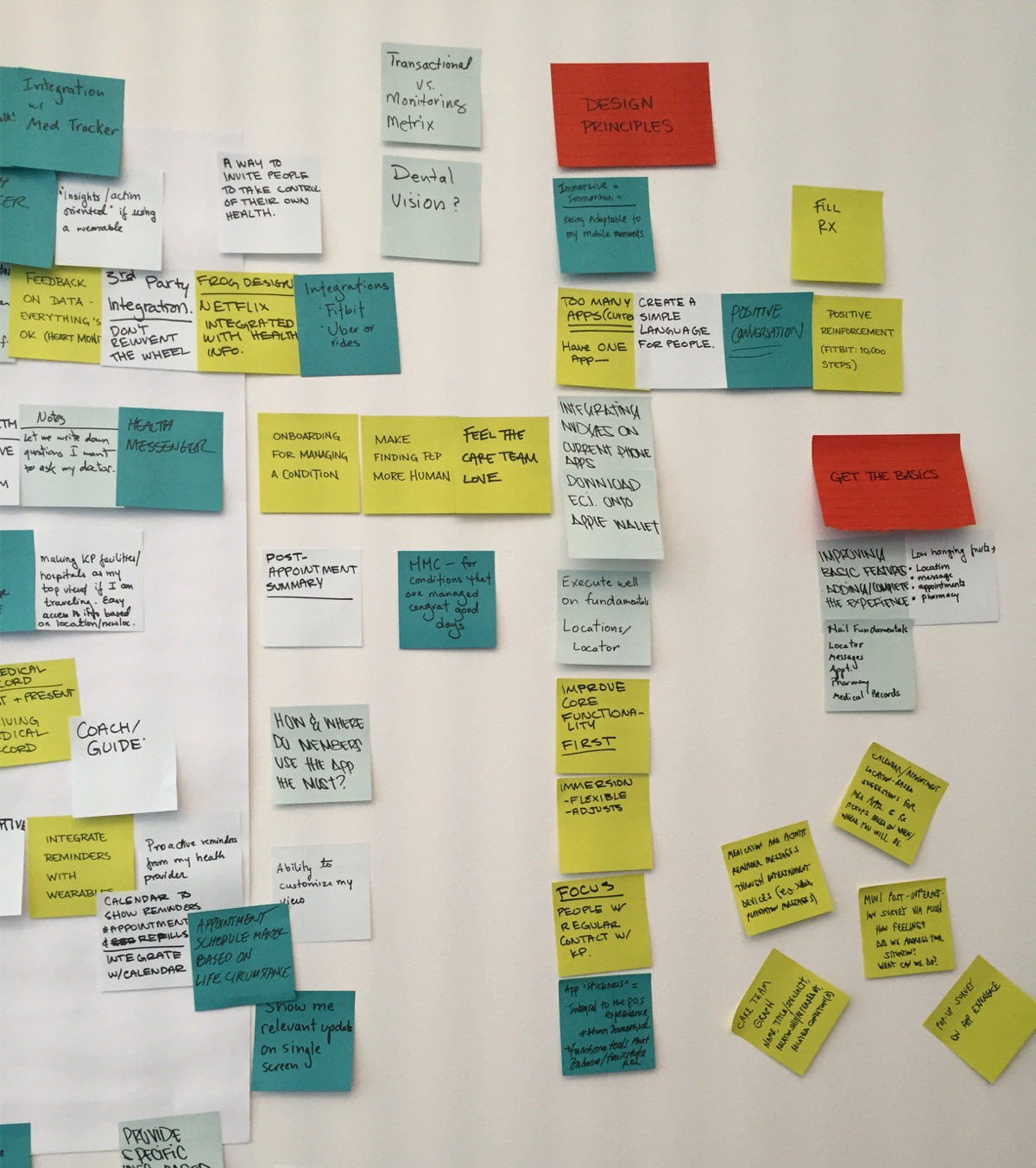
Solution Concepts
Start Wide, Then Refine
We started inclusively, touching on many different aspects of the challenges posed by users. Each concept addresses a different user pain point. For example, one focuses on collecting health data and could integrate with devices like FitBit, while another strips away extraneous features in favor of an open, ongoing conversation with your care team.

Wireframing
Feature Prioritization
Nail The Basics
How to choose which concepts would best fit user needs and business goals? It was crucial for the first version of the app to address all major use cases, including scheduling an appointment, refilling a prescription, and accessing your medical record, among others.
To clarify which features to incorporate, such as health tracking, care team chat, and third-party integration, we created a list prioritized by “ease of access” and “immediacy of usage.”

Creative Directions
Build and Extend
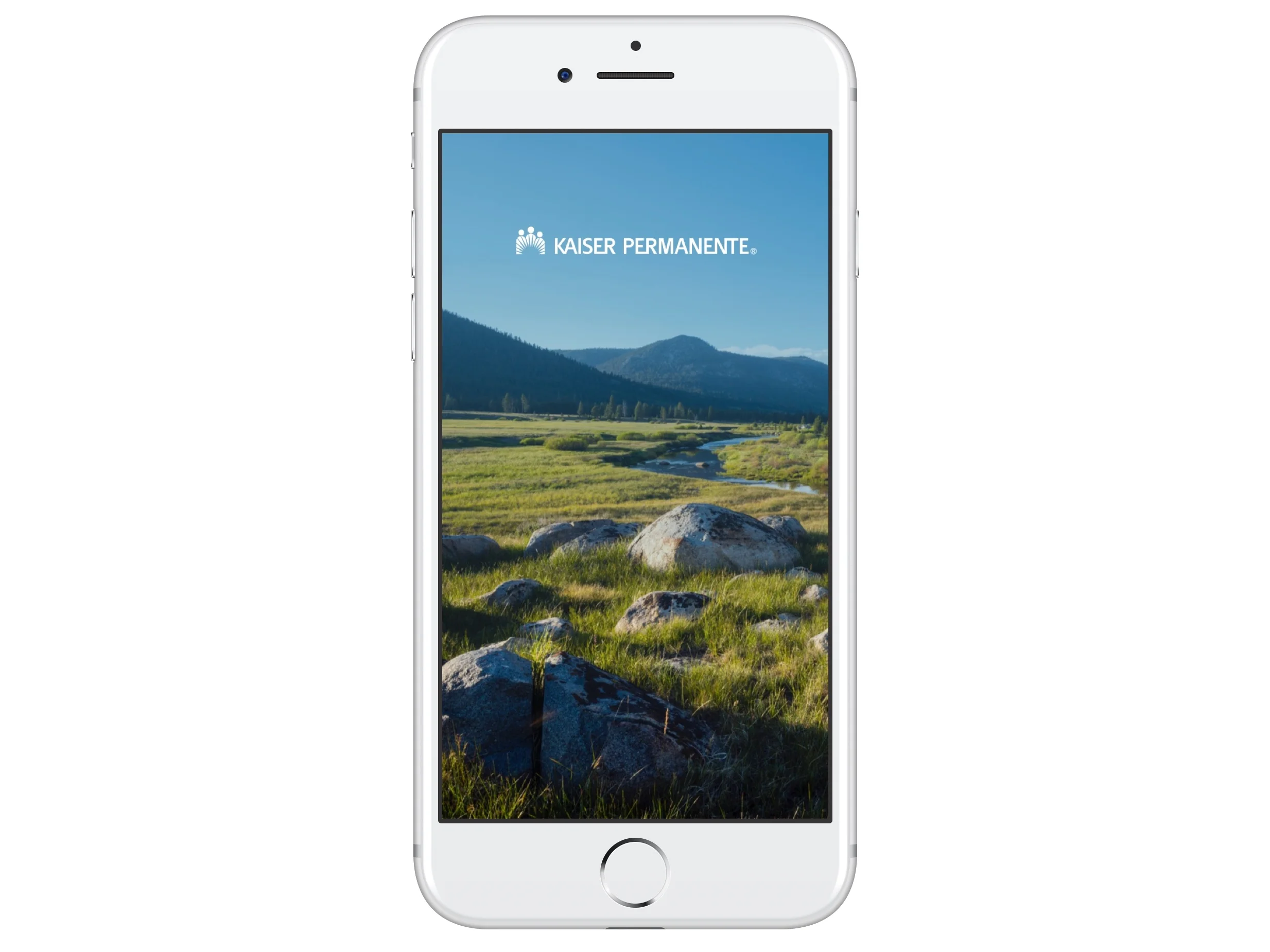
What would the finished product look like? We created several prototypes incorporating photography, color, and typography to bring it to life.
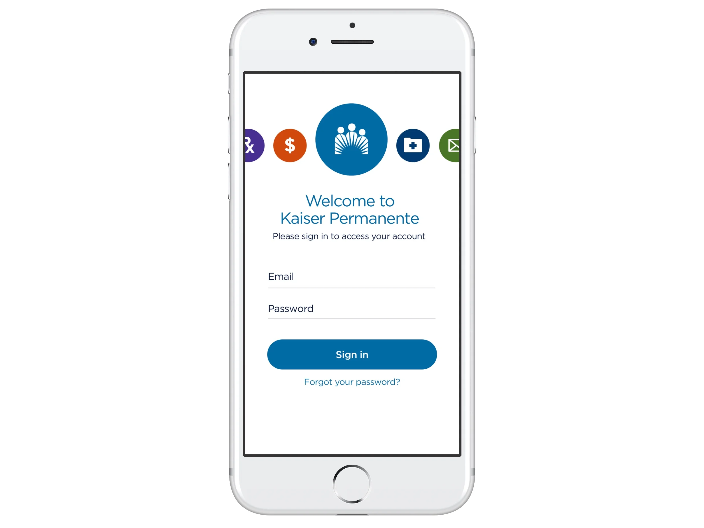
Mobile Web Enhanced
Inspired by designs approved for the mobile website, smooth transitions and subtle animations give this option the feel of a native app.
Motion design by Mike Iseri

A Swipe of Color
This option allows the user to navigate with a swipe across each major section, using the KP color palette as an attractive, clear way for the user to know where they are in the app.
Motion design by me
The Redesign
Introducing an Enhanced Experience
The Swipe of Color prototype was chosen by stakeholder consensus as well as being the preferred option when shown to users. The next iteration incorporated a broad range of feedback primarily related to the user experience.


“[The app] tries to anticipate what’s most used and make it more prominent, so that helps a lot. The consistency between the desktop and mobile experiences eliminates the learning curve.”
Learnings
Problem
The project started with a wide scope. We tried to “boil the ocean” by doing too much at once.
Insight
Focus on core user experience. Start small and concrete for the first version and build up.
Problem
The team had some turnover during the project. Each time new people joined, we had to reconstruct context, which took away from time that could’ve been spent moving forward.
Insight
Document as you go. For larger projects, keep an anchor member on the team to provide continuity.