These Paws Brand Identity + Web Development
A local woman-owned dog walking and pet sitting company
Challenge
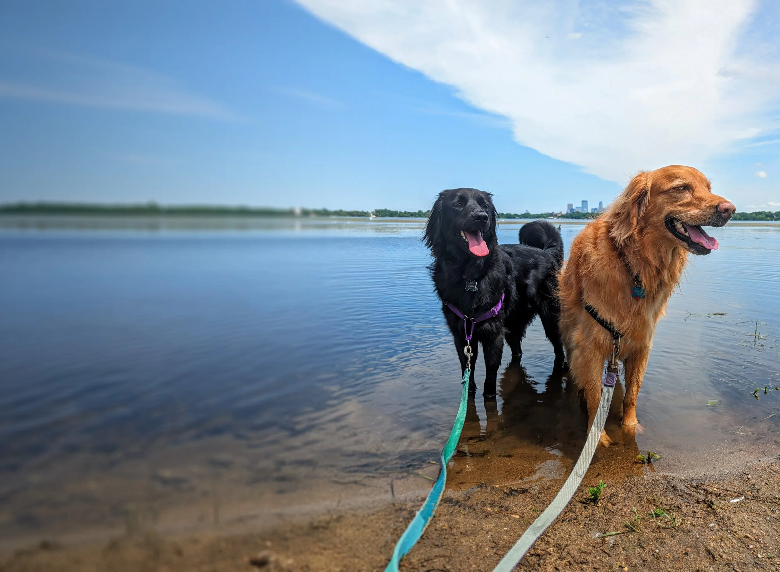
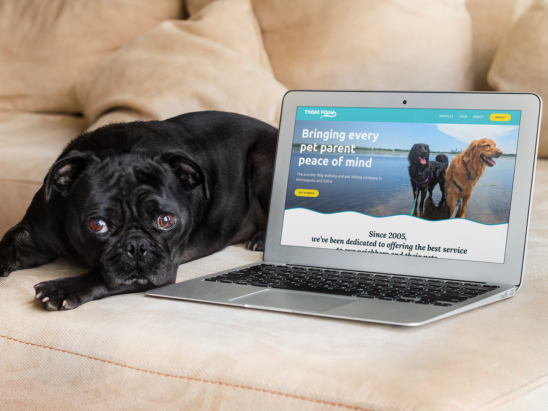
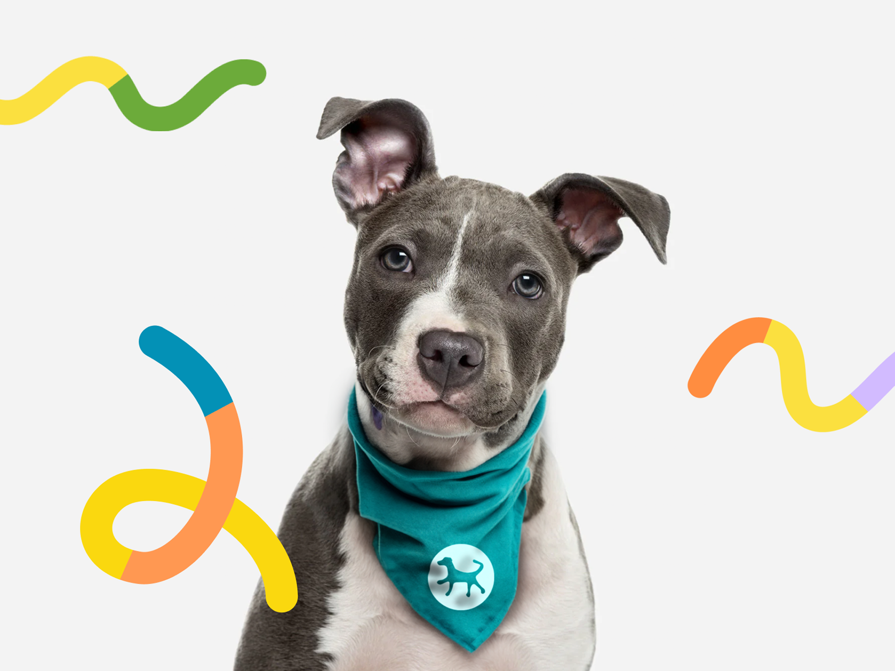
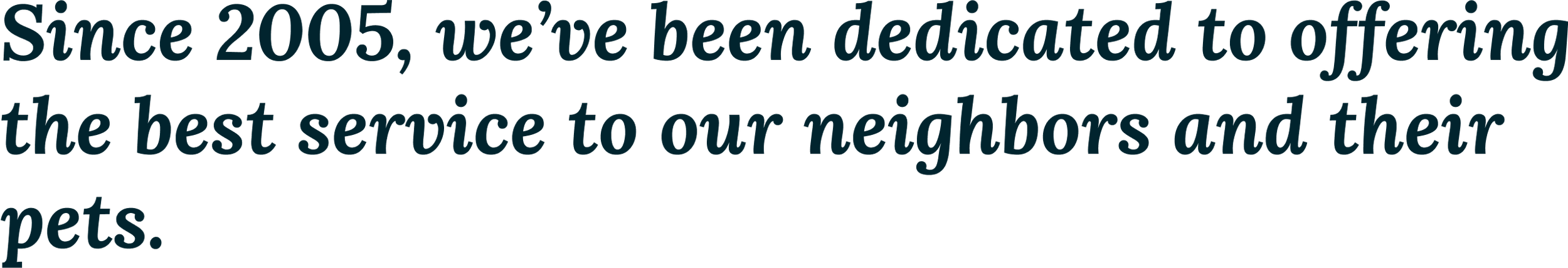
These Paws Were Made For Walkin' has been a mainstay for dog owners in Minneapolis for nearly two decades. After a slowdown in 2020, the owner was ready to revamp These Paws’ digital marketing. She approached me for a full brand identity makeover and responsive website, including redesigning the original 2005 logo.
Approach
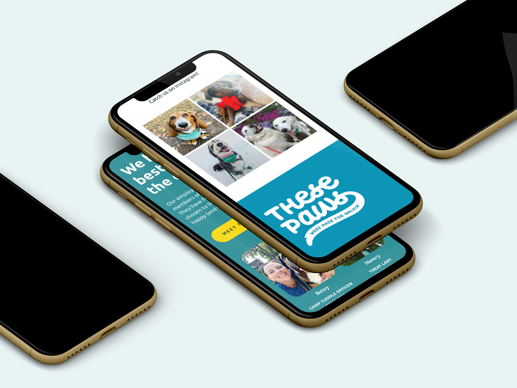
These Paws nurtures a loyal clientele; the team has cared for many dogs from puppyhood to end of life. We modernized their web presence by streamlining content, and I built a newly responsive site to replace the previous static site. Brand design and color choices celebrate the bright sunny outdoors where dogs are in their element.
Project Scope
Brand strategy
Logo
Color and typography
Responsive web design
Brand guidelines
Logo
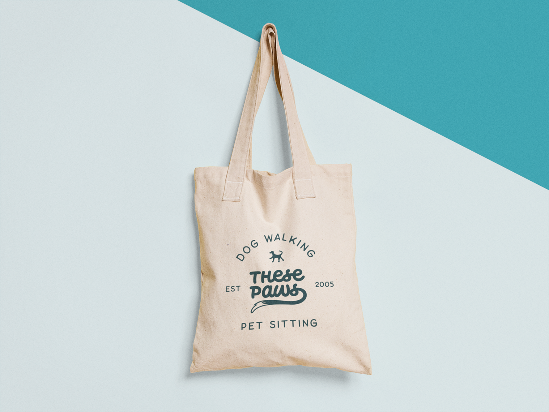
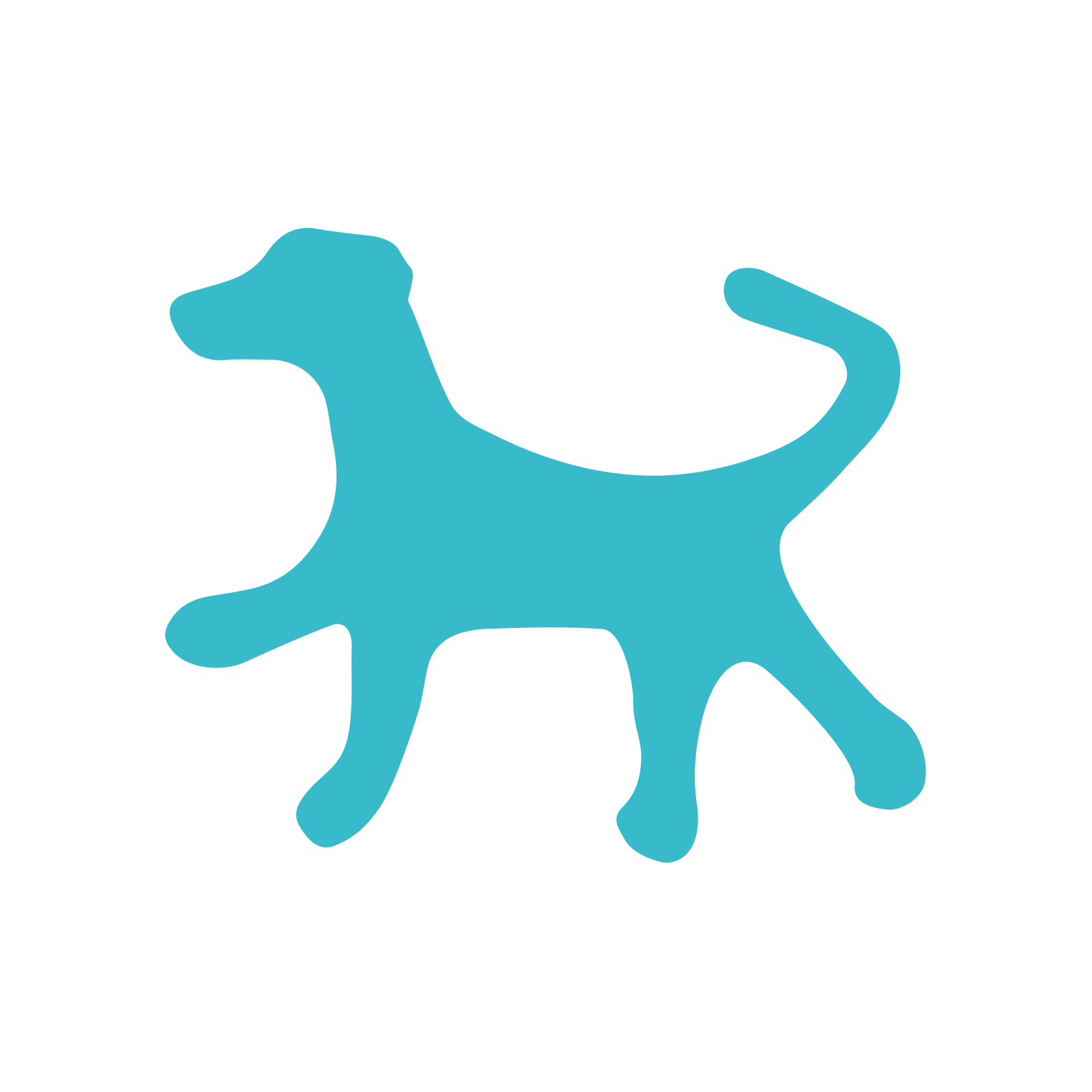
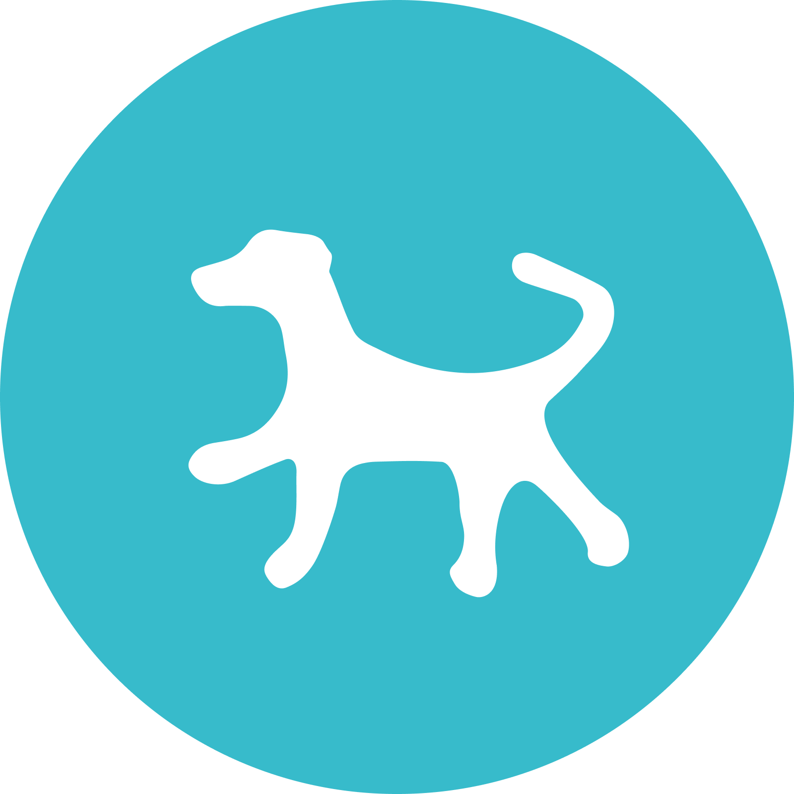
With adaptability in mind, we created a system to support the logo at every size, ensuring clarity from large-format graphics to small screens. The visual element of a swash descending from the "s" looks like a cheeky wagging tail. Choosing a bold round handwritten script speaks to personal relationships with each client and embodies the vitality of life with dogs. A playful upswept motion runs through letter connectors while the steady horizontal baseline emphasizes trust.
Sky
Hex
RGB
CMYK
37BBCB
55, 187, 203
67, 2, 20, 0
Bde Maka Ska
Hex
RGB
CMYK
DFEED6
3, 145, 182
81, 28, 18, 0
Bde Maka Ska Dark
Hex
RGB
CMYK
01242E
1, 36, 46
91, 69, 58, 66
Sunflower
Hex
RGB
CMYK
F9CE35
249, 206, 53
2, 17, 89, 0
Prairie Grass
Hex
RGB
CMYK
6CAB3A
108, 171, 58
64, 11, 100, 1
Superior National
Hex
RGB
CMYK
07773F
7, 119, 63
89, 29, 97, 17
Color
Picking slightly unexpected versions of colors associated with the outdoors – such as teal (the client's favorite color) versus sky blue – emphasizes the character and uniqueness of the brand. Blue is trustworthy and green is associated with nature. Rover and Wag!, nationally-recognized pet care companies, use green as their primary brand color, so Sky was also a good choice for differentiation.
Ubuntu
Lora
Source Sans Pro

Typography
Our type choices strike a balance between warmth and professionalism — approachable without sacrificing the sense of trust and credibility the brand depends on.
Ubuntu. Organic shapes are friendly and approachable, in line with relational aspects of brand values. A Humanist san serif, Ubuntu draws on elements of calligraphic handwriting and the proportions of classical Roman typefaces.
Lora. Ubuntu can be a little pared back and minimalistic, which is why it loves this contemporary serif, especially the personality of the italic.
Source Sans Pro. A professional sans serif great for labels and highly legible at small sizes.
